
3 Takeaways as a Quality Assurance Intern An Intern's Experience + New Polaris Module
Hi! My name is Lisa and over the winter co-op term, I worked as a Quality Assurance (QA) Analyst for Polaris Intelligence as a student from the University of Waterloo. Polaris Intelligence provides clients with in-depth consumer insights to help our clients better understand their customers, analyze markets, and, most importantly, help them make well-informed business decisions.
Interning at Polaris Intelligence provided me with the opportunity to:
- Gain experience as a QA Analyst
- Expand beyond my QA Analyst role
- Work alongside the software developer intern and the software development team to execute a project
My Experience in a QA Analyst Role
As a QA Analyst, my primary responsibilities included testing the Polaris Intelligence application for bugs, testing finished tickets on JIRA (a project management platform) to confirm the issues were fixed, and helping my coworkers with any other testing and input they needed. When I started my co-op, my work day consisted of testing the website. Testing the website allowed me to gain a better understanding of how Polaris works and what the user experience is like.
Expanding Beyond my QA Analyst Role
Although I was first and foremost a QA analyst, I was able to explore many other tasks. I think this is one of the best parts of working at a smaller sized company; you are able to take on tasks that interest you even if it is not directly related to your hired role. Personally, I asked to take on more web development responsibilities. Instantly, the team helped me set up the development environment, provided me with coding tickets, and answered any questions I had.
One of my favourite parts during my co-op was designing modules with Figma. I learned more about user accessibility and getting to design the flow of new features and modules was a fun break away from testing. I was happy that the other intern and I had opportunities to present and share our knowledge to the team. I did a demo that showcased how the team may utilize Figma to create high-fidelity designs of a potential new feature. Figma helps the team visualize and discuss all aspects of a potential new feature prior to implementing it.
Working with the Software Development Intern
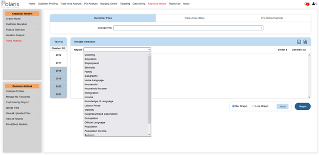
One of the projects I worked on with the Software Developer Intern, Tristan, was our new Trend Analysis page. Our clients had expressed their desire for a module to help them compare historical data and predict future trends. Tristan and I worked together on the Trend Analysis Module. The final page allows users to visualize historical data across 23 reports from 2016 to 2021 for their selected area or their customer files.
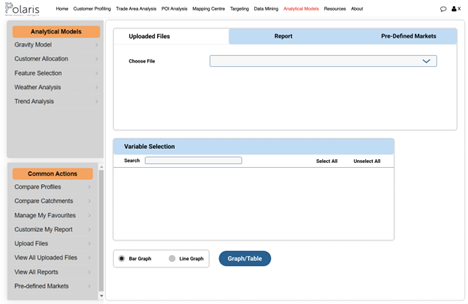
When we first started the project, we had a lot of discussions with the team to see how they wanted the project to look and how to implement the features. Then, we moved on to designing the layout. Our design objectives were to create something modern-looking, user-friendly and accessible, while still maintaining the same theme as the rest of Polaris. Here was our first iteration of Trend Analysis!
I mainly helped with the design, and Tristan worked on developing the code to make the design a reality on Polaris.
The Final Result: Trend Analysis Module
Now, let’s walk through a quick demo of Trend Analysis.
- Select a file, trade area, or pre-defined market (CMA/CA or CD/CSD) to analyze.
- Select one year or multiple years. From there, you can choose from one of 23 reports. The reports range from household income to labour force to neighbourhood description and 20 more! The team will expand Trend Analysis to cover over 112 reports across demographics, lifestyles, consumer behaviour, product usage, media usage, psychographics, and leisure activities, for more than 30,000 variables!
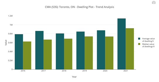
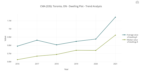
- You should now be able to see all the values and percentages of each variable throughout your selected years.
3. Lastly, you can visualize the data via a bar or line graph to see the trend line. To do this, click on specific variables from your selected report that you would like to see graphed. Once they are selected, you can populate a bar graph, line graph, or both. You now have your trend analysis and can repeat for any variables!
Conclusion
I thoroughly enjoyed my time at Polaris Intelligence! I had many opportunities to learn and grow my skill sets, as seen through the development of the Trend Analysis Module. Now it is back to the school term for me!
Want to try Trend Analysis for your business needs? Contact Us to learn more!
Like what you see for Trend Analysis? Check out some of our other products!